NHS urgent care self-service
This kiosk based digital front door captures patient data and symptoms at the entrance of emergency departments, triages them, tells them where to go or offers a later appointment. The introduction of the tool reduced waiting times for patients significantly and freed up clinicians time.

Company
NHS England (public health service in England)
Time
2024-present
User base
> 1.8 million patients triaged in 19 clinics

The digital front door at the Royal Bournemouth Hospital emergency department
Background
The idea for the urgent care self-service tool originated in the Coronavirus pandemic, when waiting rooms in emergency departments were reaching their capacity and a solution was sought to reduce the number of waiting patients and free up clinician time by introducing a self triage. Similar to 111 online, patients should be triaged with the NHS pathways system. An agile team consisting of a product management, medical experts, developers, implementation managers and user-centered design practitioners was formed that since design, develop and distribute the solution to more and more clinics.

Start screen of urgent care self service tool
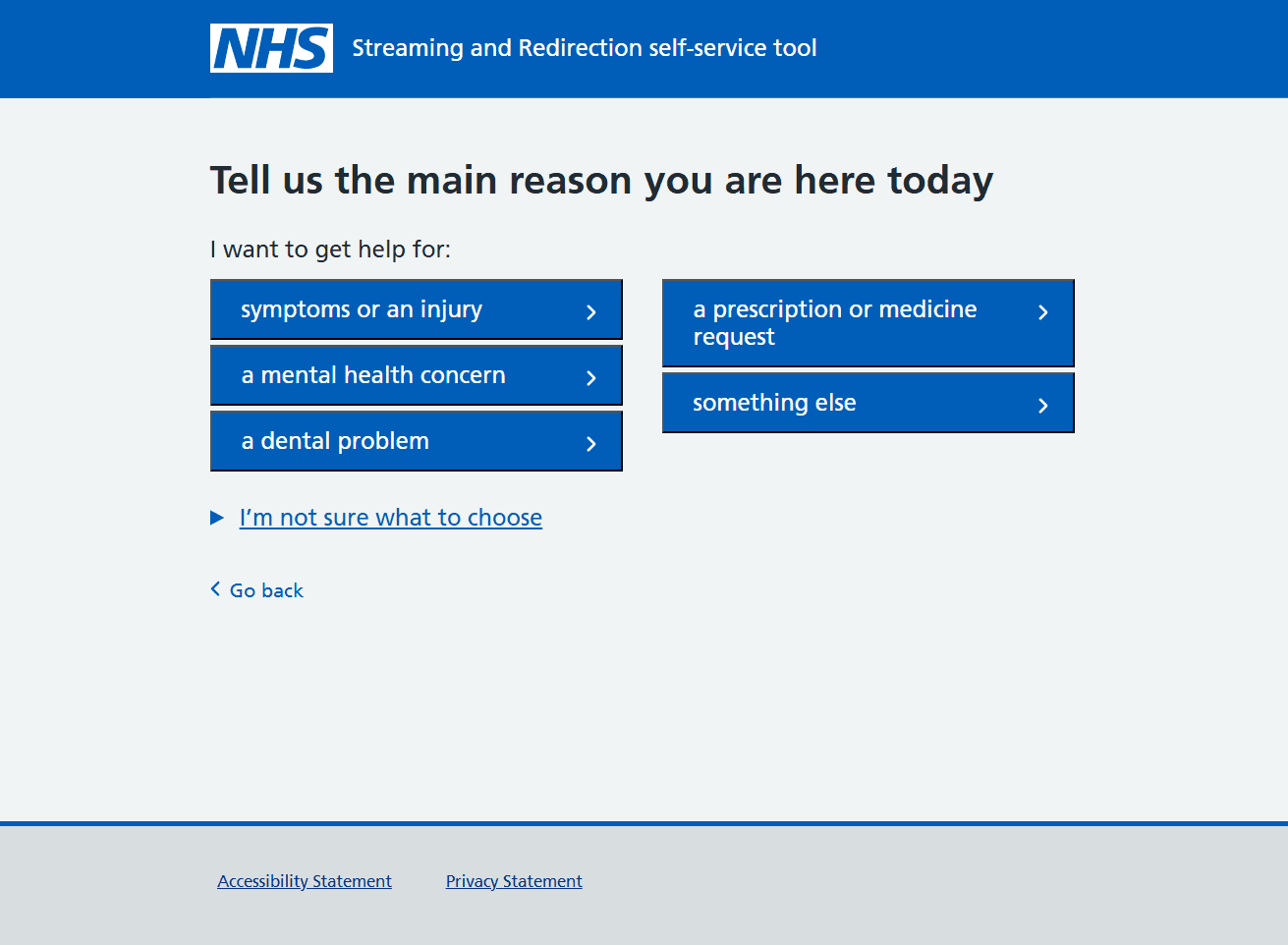
Screen for selection of reason for coming
My role
As part of the UCD team, I was working with a content designer, service designer and a user researcher on improving the product based on user research results, analytics, site feedback and making it comply to legal requirements. My personal contributions include:
Redesigning the screen flow before the medical triage in order to streamline and shorten the user journey for patients with appointments or referrals from 111 or healthcare professionals
Ideation of design concepts for AI supported user intent classification based on a user's free text input about what they need help with
Ensuring WCAG compliance
Setting up physical space design guidelines for clinics, including physical ergonomics, screen size, angle, height and signage
Redesign of redirection screen based on a user pain point identified in user research
Contributions to the design process by introducing a design history and AI generated interactive prototypes
Redesigning the redirection screen
The redirection screen gets shown to users who's triage outcome suggests that they should seek help elsewhere, e.g. because their symptoms are not severe enough to be treated in an emergency department. Two usability testing studies concluded that the screen presenting options of alternative services to use was unclear to users, especially regarding what would happen when selecting "Use this service". This is especially problematic as we know users already experience stress in this situation and might be in physical pain.
The changes were kept intentionally subtle in order to not divert from the well tested and medically assured user flow on this screen. We hypothesize that this will give the right amount of assurance in an emotionally stressful situation in order to give the user a clear understanding of what is happening and what the options are to get treatment. This hypothesis is scheduled to be tested in future usability testing rounds before being released.

Before the redesign

3
After the redesign
Changes made
After an ideation workshop and parallel prototyping followed by team design crits, I targeted this problem by making the following adjustments to the design:
1
Making the screen specific to the site type (e.g. 'pharmacy' or 'Urgent Treatment Center') since only sites of one type can be recommended anyways. This allows us to make the outcome clearer by adding the type into the heading, declutter the page by removing repetitive uses of the site type and adding site specific guidance.
2
Moving guidance explaining "Why should I use this service instead?" to this decision page. Previously, this was only visible once a user had chosen a specific site they want to go to
3
Working with the content designer to change button labels from "Use this service" to "Send my details" or "Get directions" depending on whether the site would accept a referral with the triage data. This was intended to give users reassurance that answering the triage questions was not for nothing and a referral would be sent and being honest in the very rare cases where a referral is not possible
Challenges
Since this is a product that is used by patients in emergency care, changes to the product can have big implications about the treatment received by patients. This is why changes and design processes need to be documented and every release needs to undergo a clinical review. As a designer I need to make sure that every change is viewed from a patient safety perspective and the view of medical experts is considered.
Some aspects of the interaction design are partly out of our control, like the physical space design around the kiosks including signage. As every site is different and needs a tailored solution, which they mostly design by themselves. We found a flexible approach to give implementation guidelines (e.g. regarding physical ergonomics, kiosk design and signage) while still considering that every site has different physical layouts and processes.
patients triaged
48%
reduction of patients in the waiting room*
53%
of patients spend less time in the emergency department*
132 hours
of clinician time saved each month in one clinic*
*Data is based on the model region East Lancashire